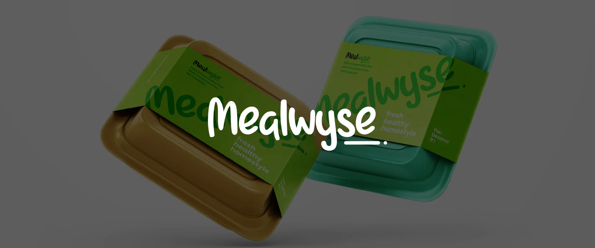
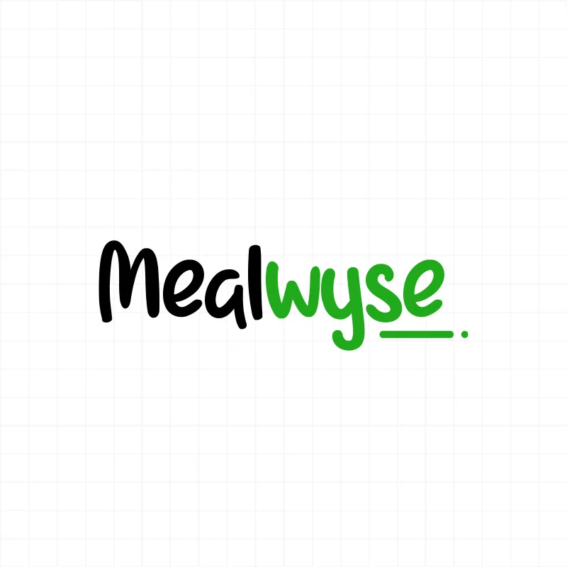
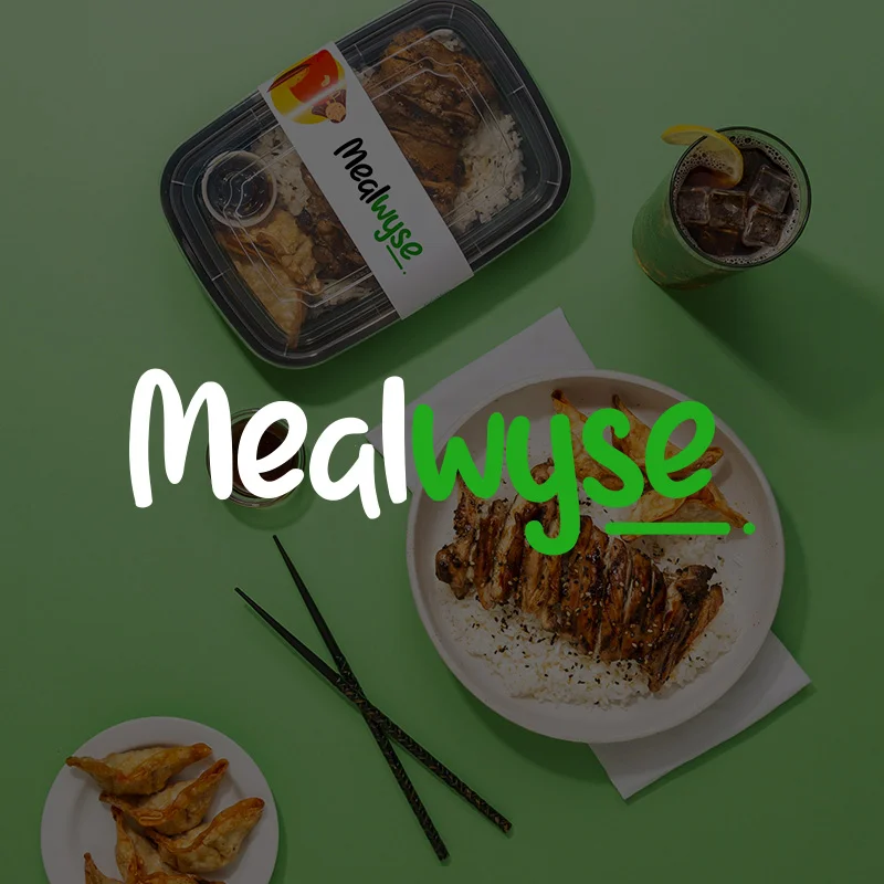
A typography-based approach was chosen to maintain simplicity while ensuring strong brand recognition. The logo and app icon were crafted with clean, modern typography that conveys friendliness and approachability. The packaging design followed a minimal yet functional aesthetic, enhancing the user experience while reinforcing Mealwyse’s identity. The final design perfectly aligns with the brand’s positioning, keeping it straightforward, memorable, and reflective of its core values.